Brand identity / Product2026
Forma Objects
A quiet, tactile identity for a ceramics label, built from the proportions of the objects themselves.
- Brand
- Packaging
- Art Direction

Independent creative studio / Selected work 2022—2026
12 selected projects
Brand / Digital / Art Direction
OFFSET partners with ambitious people to build distinctive identities, digital experiences, and visual worlds.
02Selected work
Scroll or swipe sideways, use the arrow keys, or jump with the index below. All projects are fictional samples.
Brand identity / Product2026
A quiet, tactile identity for a ceramics label, built from the proportions of the objects themselves.

Art direction / Hospitality2025
Art direction for a small mountain hotel, shaped around slow mornings, long shadows and very little noise.
View Project: Still House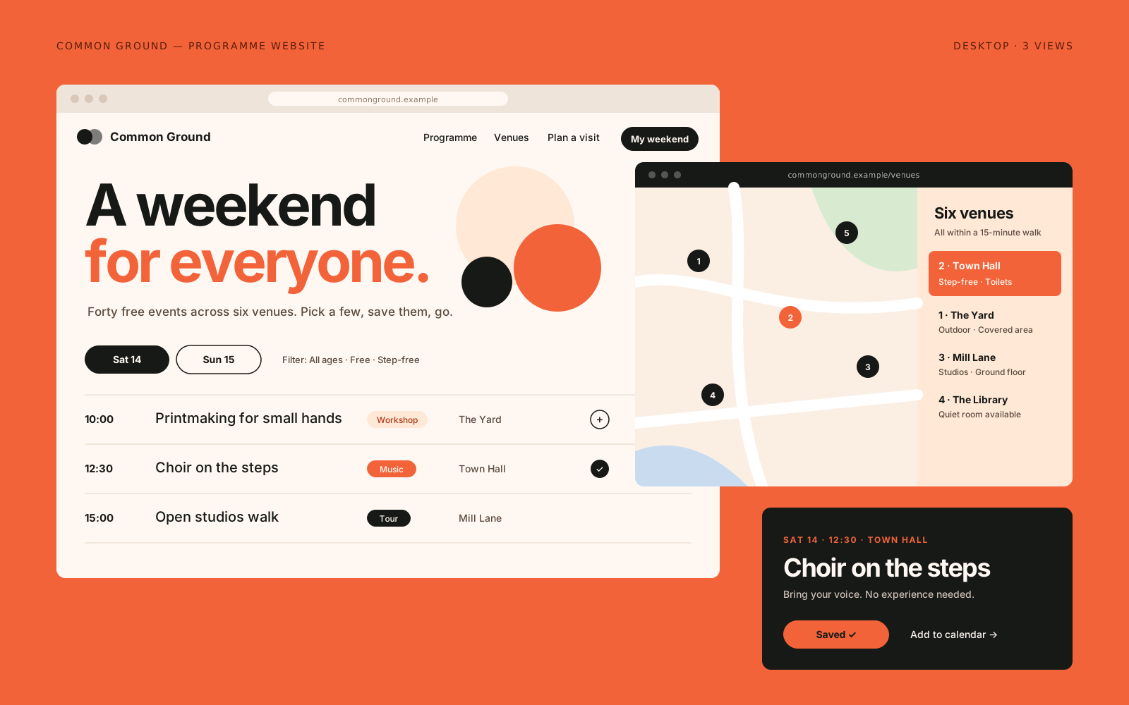
Digital experience / Culture2025
A programme website for a community arts festival, designed to make a busy weekend easy to plan.
Issue 04
Editorial / Publishing2024
A twice-yearly journal about walking and land, with a typographic system that leaves room to breathe.
View Project: Field Notes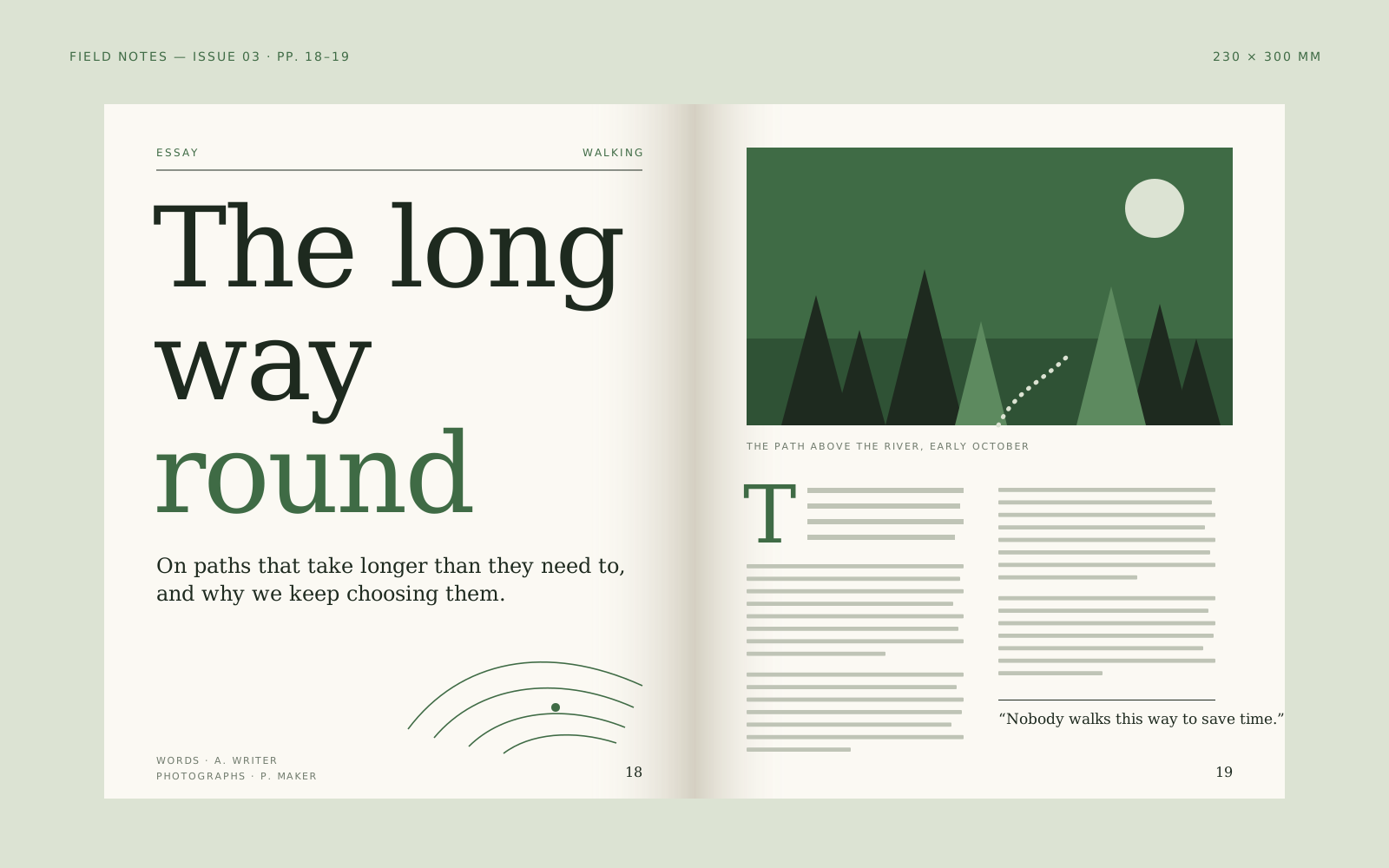

Brand system / Outdoor2024
A brand system for an outdoor gear maker, drawn from contour lines and the plain language of trail signs.
View Project: Northline“A reasonable week.”
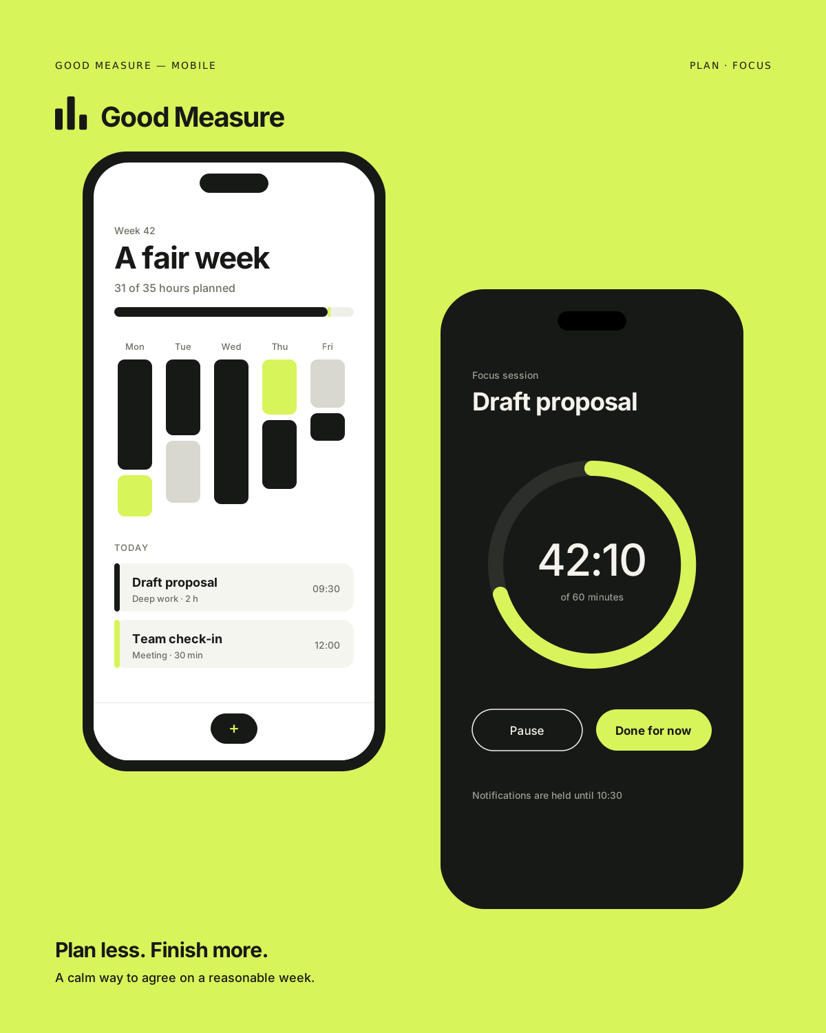
Digital product / Technology2026
Product design for a calm planning app that helps small teams agree on what a reasonable week looks like.

Campaign / Food2025
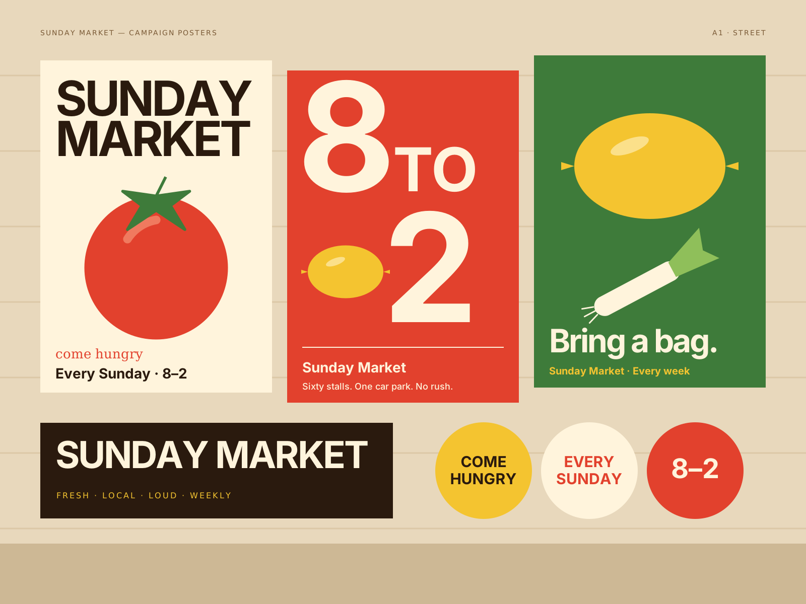
A loud, generous campaign for a weekly food market: big type, real produce and an open invitation.


Art direction / Music2025
Art direction for an ambient record label: black and white imagery, one colour, and a lot of air.
View Project: Soft SignalWebsite / Creative technology2026
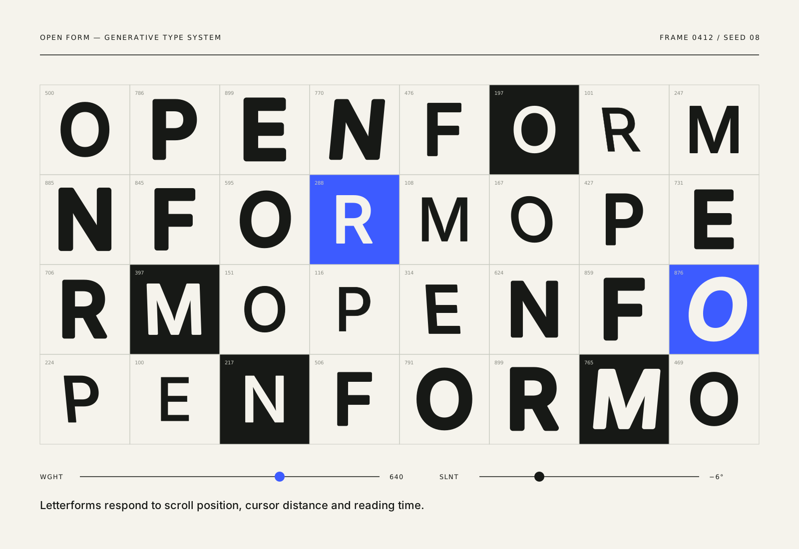
A website for a creative technology lab, with a generative type system that reshapes itself as you read.
View Project: Open FormCampaign / Culture2026
A late-night programme campaign for a city museum, written in condensed type and lit in a single green.
Horizontal gallery of 12 projects. Use the left and right arrow keys, or the project index below, to move between projects.
Showing project 1 of 12
Forma Objects
03The studio
OFFSET is deliberately small. Every project is led by the people who pitch it, and the same senior designers stay with it from the first workshop to the final file.
We work with founders, cultural organisations and product teams who would rather be remembered than blend in. That means saying what we think, showing ideas early, and making fewer, better things.
04What we do
05Featured project story
Brand identity / Product — 2026

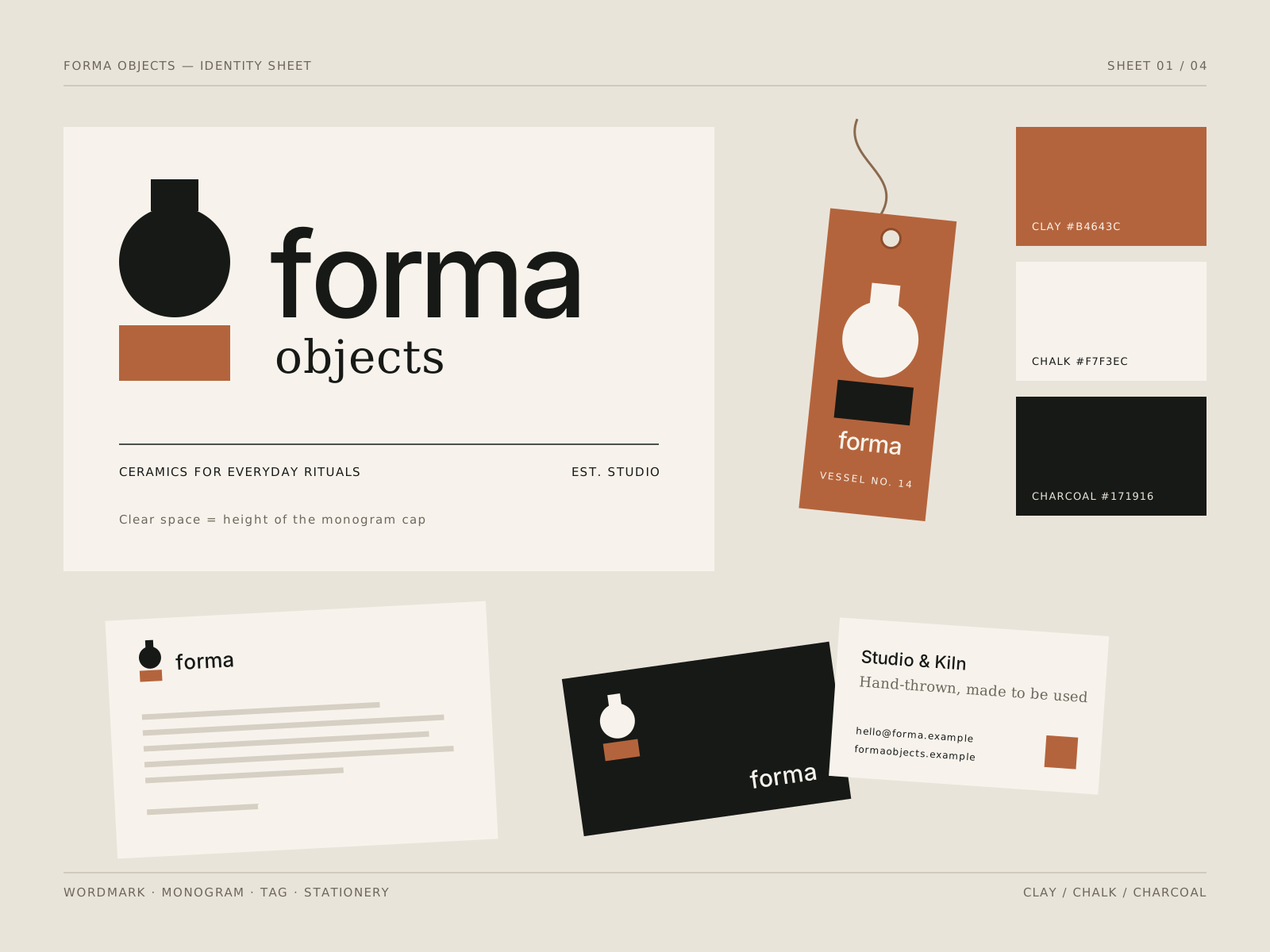
Forma Objects is a fictional studio pottery making small runs of vessels, cups and planters. The brief we wrote for ourselves was simple: build an identity that feels as considered as a hand-thrown pot, and that steps back whenever the objects are in the room.
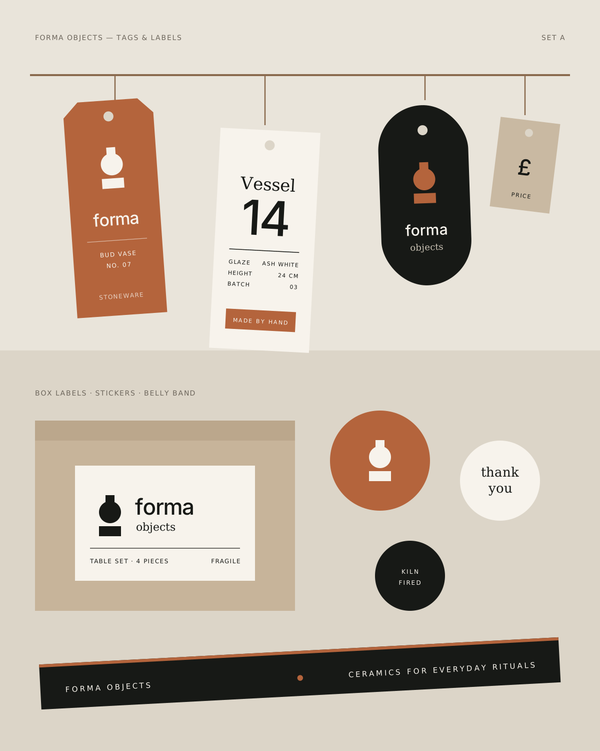
The result is a restrained system of a drawn wordmark, a monogram cut from the profile of a vessel, a palette of clay, chalk and charcoal, and a set of tags and labels that work as hard on a shelf as they do in a shipping box.
Ceramics brands tend to fall into two camps: rustic and handwritten, or so minimal they disappear. Neither suits a maker whose work is precise but warm. The identity needed to hold both qualities at once without leaning on clichés like brush marks or thumbprints.
01Proportion first
We traced the silhouettes of twelve pieces and found a recurring ratio between shoulder and base. That ratio sets the monogram's curve, the wordmark's x-height and the margins of every printed piece, so the system literally shares the shape of the work.
02A wordmark with weight
The wordmark is built on a sturdy grotesque, redrawn with slightly softened terminals and a wider O. It holds up when debossed into card or stamped into clay, where thin strokes would fill in and disappear.
03Material over decoration
Rather than adding pattern, we specified uncoated board, a single clay-red ink and blind embossing. The packaging gets its character from texture and from what is left blank, which keeps attention on the pots.
04Photography with long light
The art direction asks for one object, one light source and one shadow. Darker frames show the matte glazes; paler frames show form. Both rely on natural light and no props beyond what a pot would actually sit beside.
Weeks 1–2
Listen and define
Studio visits, object audit and a short written positioning.
Weeks 3–4
Visual idea
Three routes narrowed to one, tested at tag and stamp size.
Weeks 5–8
Make and refine
Wordmark drawing, print tests on three paper stocks, packaging prototypes.
Weeks 9–10
Ship with care
Guidelines, artwork files and a photography reference set.
06How we work
01
We spend the first weeks asking questions, reading everything you have and writing a short brief in plain language. Nothing visual happens until we agree on what the work needs to do.
02
We explore a few honest routes, then commit to one idea that answers the brief. You see it applied to real things early, not just on a moodboard.
03
The idea becomes a working system: type, colour, layouts, screens, packaging or film. We test it, show it to the people who will use it and tighten it until it holds.
04
We prepare files, guidelines and builds properly, then stay close through launch. Your team should be able to carry the work forward without us.
07Field notes
IdentitySample article
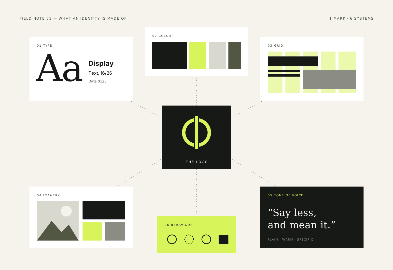
A logo is the smallest part of an identity people see the most. The real work is in the system around it: type, colour, voice, imagery and the rules that hold them together.
08Contact
Tell us what you’re building. We’ll work out the next step together.
Prefer a form? Use the contact page. We usually reply within two working days.