Why a Good Identity Needs More Than a Logo
A logo is the smallest part of an identity people see the most. The real work is in the system around it: type, colour, voice, imagery and the rules that hold them together.
- Published
- Reading time
- 5 min read
- Status
- Sample article
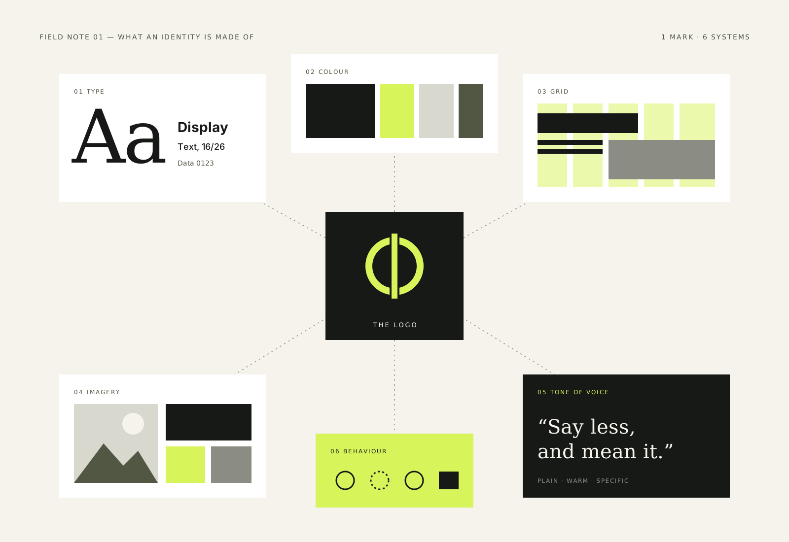
Most identity projects begin with someone asking for a logo. It is a reasonable request. The logo is the most visible part of a brand, it goes on everything, and it is easy to point at. But when a new identity feels thin six months after launch, the logo is rarely the problem. The problem is usually everything that was supposed to surround it and never did.
An identity is the set of decisions that make a company recognisable when its name is not on the page. If you covered the logo on a poster, a website or a box, would you still know whose it was? If the answer is no, the identity is not finished yet.
The logo is a signature, not a personality
A good logo works like a signature. It confirms who something is from. It should be distinctive, durable and simple enough to work at the size of a favicon and on the side of a van. What it cannot do on its own is carry tone, explain a point of view or make a long document feel considered.
Personality comes from repetition of choices across many surfaces. The way headlines are set. The colour that appears when something important happens. The kind of photograph that gets chosen, and the kind that never does. These choices are quieter than a logo, but people notice them far more often, because they make up most of what anyone actually sees.
What a working identity includes
Every project is different, but most useful identity systems cover a familiar set of parts. The point is not to produce all of them for their own sake. The point is to make sure nothing important is left to chance.
- Typography: a small number of typefaces, with clear roles for headlines, text and labels.
- Colour: a palette with rules about proportion, not just a row of swatches.
- Layout: a grid or set of compositional habits that make pages feel related.
- Imagery: guidance on what to photograph, how to light it and how to crop it.
- Voice: how the brand writes, including words it uses and words it avoids.
- Graphic devices: any recurring shapes, lines or patterns, and when to use them.
- Examples: real applications that show the system working under pressure.
The last item is the most often skipped and the most useful. Guidelines that only show the logo on a white background do not help anyone design a sales presentation at short notice. Examples of difficult cases, such as a long table, a dense form or a social post with too much text, show how the rules hold up when things are not perfect.
Rules about proportion matter more than rules about colour
Two brands can share almost the same palette and look nothing alike. The difference is in the proportion. One uses its bright colour across every surface; the other uses it once per page, for the one thing that matters. The second approach almost always feels more confident, and it gives the accent colour a job to do.
An identity is the set of decisions that make a company recognisable when its name is not on the page.
We find it helpful to describe colour as a ratio rather than a list. Mostly paper and ink, occasionally a mid-tone, rarely the accent. That single sentence does more to keep a brand consistent than a page of hex values.
Design for the boring places
Identity work is usually presented through the most exciting applications: a billboard, a shop front, a launch film. Those matter, but they are rare. The places an identity is used every day are less glamorous: invoices, email signatures, job adverts, slide decks, help pages and packing slips.
If the system only looks good in the hero shots, the people who use it every day will quietly work around it, and the brand will drift. Designing for those everyday places is not a lesser job. It is where an identity either becomes a habit or slowly falls apart.
A simple test
Before signing off an identity, ask someone who was not involved to make three things with it: a one-page document, a social post and a short presentation. Watch where they get stuck. Every hesitation is a missing rule, a missing template or a choice that was never made clear.
Leave room for the system to grow
The best identities are firm about a few things and relaxed about the rest. They protect the core choices, such as the typeface, the use of colour and the tone of voice, and they leave space for new formats nobody has thought of yet. Over-specifying every margin makes a system brittle. Under-specifying makes it vague.
So when a project starts with a request for a logo, we still make the logo with care. It matters. But we also ask where it will live, who will use it and what it needs to say when it is not there. The answers to those questions are what turn a mark into an identity.
Keep reading
Identity ·
Choosing Typefaces for Systems, Not Moments
Process ·
Briefs That Leave Room for Ideas
Process ·
What Makes a Portfolio Case Study Useful
Contact
Have a good one in mind?
Tell us what you’re building. We’ll work out the next step together.
Prefer a form? Use the contact page. We usually reply within two working days.