04Case study
Sample projectField Notes
A twice-yearly journal about walking and land, with a typographic system that gives long writing room to breathe.
- Discipline
- Editorial
- Sector
- Publishing
- Year
- 2024
- Services
- Editorial, Print, Typography
Overview
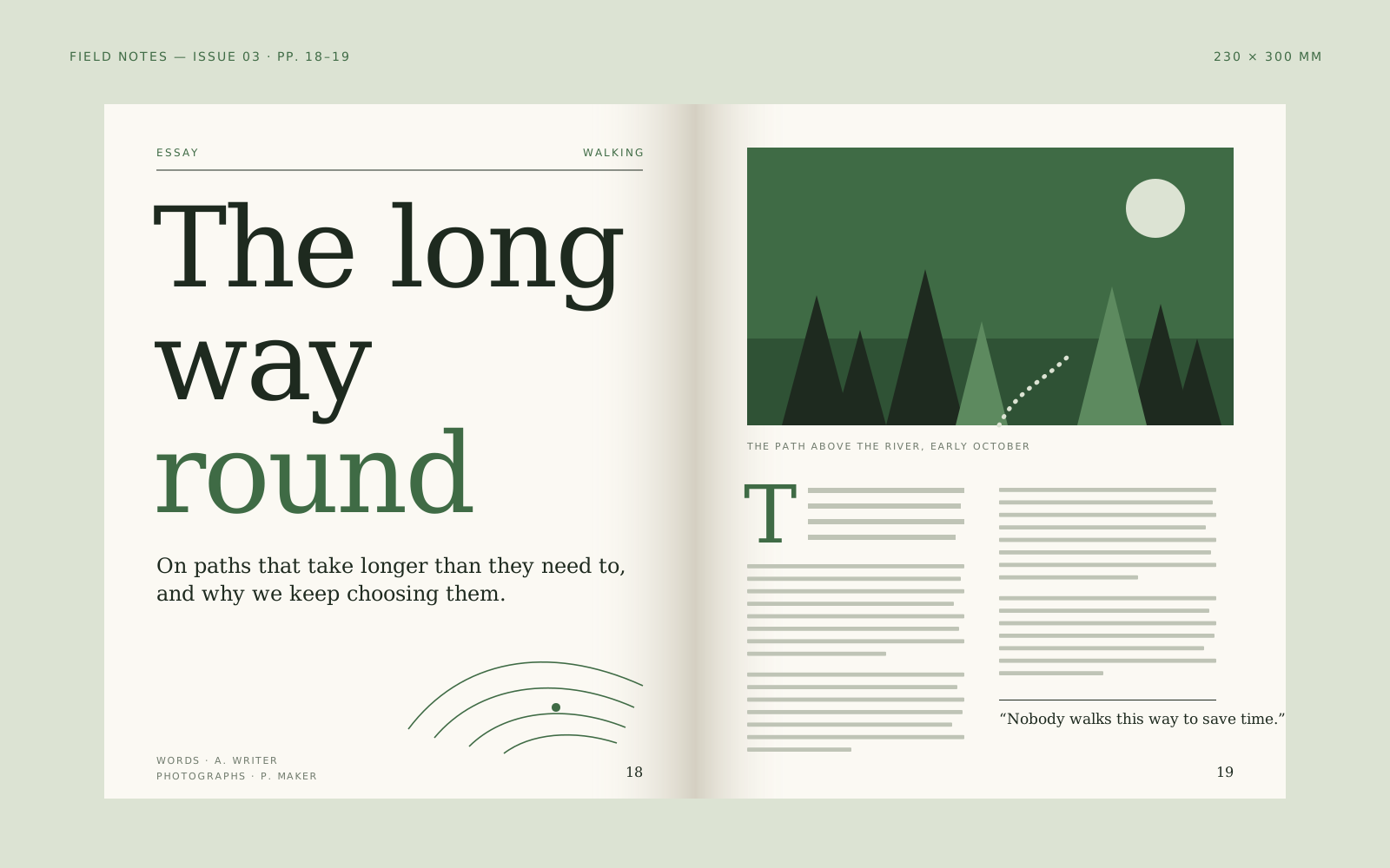
Field Notes is a fictional independent magazine of essays, maps and photographs about walking. Each issue follows a single landscape, and the writing is long, slow and personal.
We designed the format, the typographic system and the cover approach, creating a set of templates the editors can use for every issue without each one looking the same.
Challenge
Long-form print is easy to make look serious and hard to make enjoyable. Dense columns tire readers, while too much white space makes a journal feel thin. We needed a page that rewards a long sit.
Each issue also has a different subject, photographer and palette. The system had to stay recognisable on a shelf while letting each landscape set its own mood.
Creative approach
- 01
One measure, generously set
Essays are set in a single wide column of a warm book serif at a comfortable size, with large margins for maps, notes and captions. The margin becomes a place for the walk's small details: a bird, a gate, a distance.
- 02
Covers as a numbered series
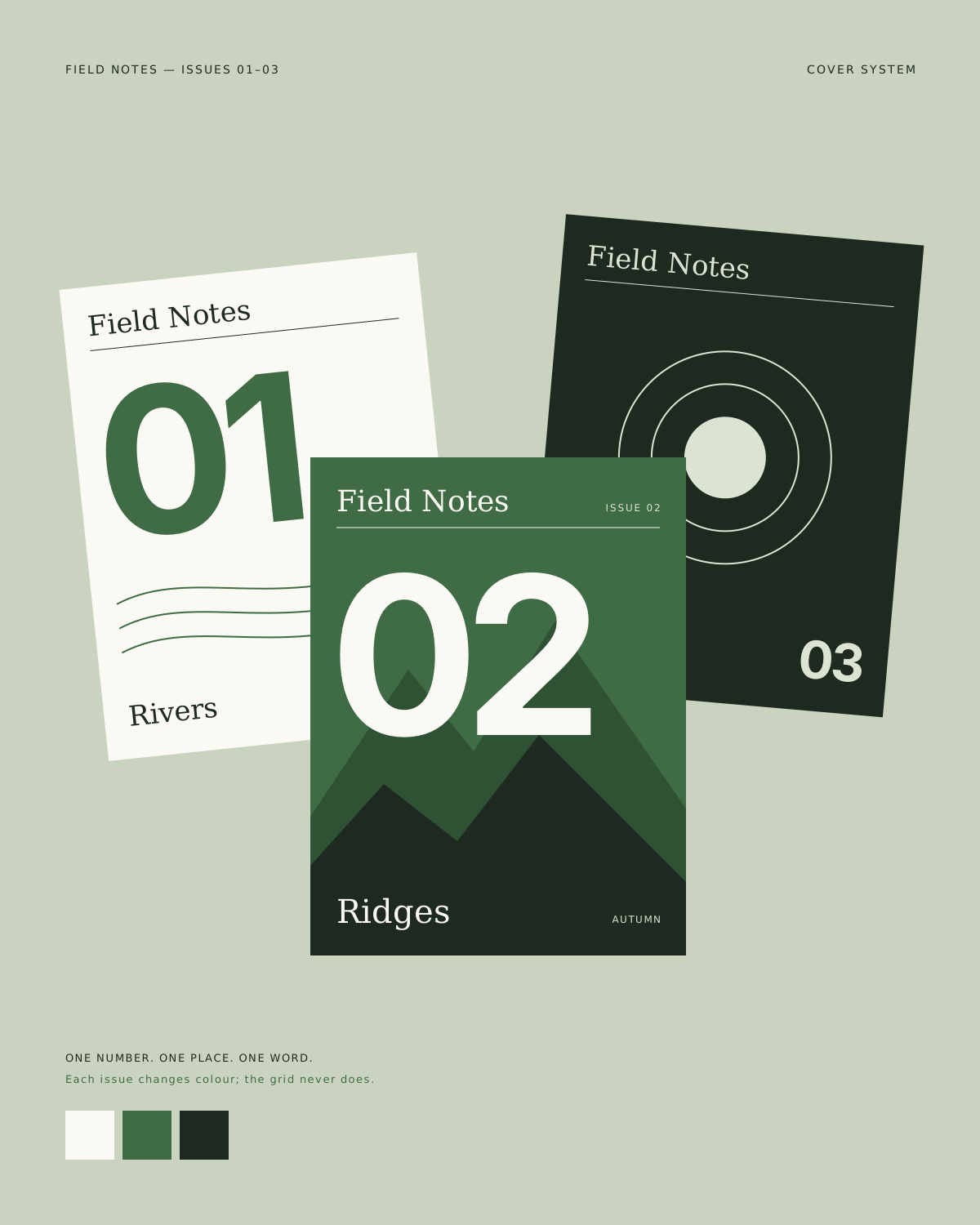
Every cover uses the same structure: a large issue number, the landscape's name and a single colour from that issue's photography. Lined up together, the issues read like a set of field notebooks.
- 03
Photography without captions on top
Images run full-bleed or sit alone on a page. Captions live in the margin or at the back, so pictures can be looked at before they are explained.

Deliverables
- Magazine format and paper specification
- Typographic system and grid
- Cover structure and series design
- Page templates for essays, maps and portfolios
- Editorial style sheet
Timeline
Weeks 1–2
Listen and define
Reading past drafts, shelf research and format sketches.
Weeks 3–4
Visual idea
Type pairing tests printed at full size and read in sequence.
Weeks 5–9
Make and refine
Templates, cover series and a complete pilot issue.
Week 10
Ship with care
Press checks, editor handover and a style sheet.
Studio roles
- Creative direction
- Editorial design
- Typography
Sample project created for the Vortex template. Not real client work.
Related work
All projects →- 11
 View →
Open Form
Website / Creative technology — 2026
- 06View →
Northline
Brand system / Outdoor — 2024
- 12
 View →
After Hours
Campaign / Culture — 2026

Contact
Have a good one in mind?
Tell us what you’re building. We’ll work out the next step together.
Prefer a form? Use the contact page. We usually reply within two working days.