06Case study
Sample projectNorthline
A brand system for an imagined outdoor gear maker, drawn from contour lines and the plain language of trail signs.
- Discipline
- Brand system
- Sector
- Outdoor
- Year
- 2024
- Services
- Brand, Signage, Wayfinding

Overview
Northline is a fictional maker of practical outdoor equipment: packs, shelters and layers for people who walk in mountains rather than pose on them. Its products are understated and built to last.
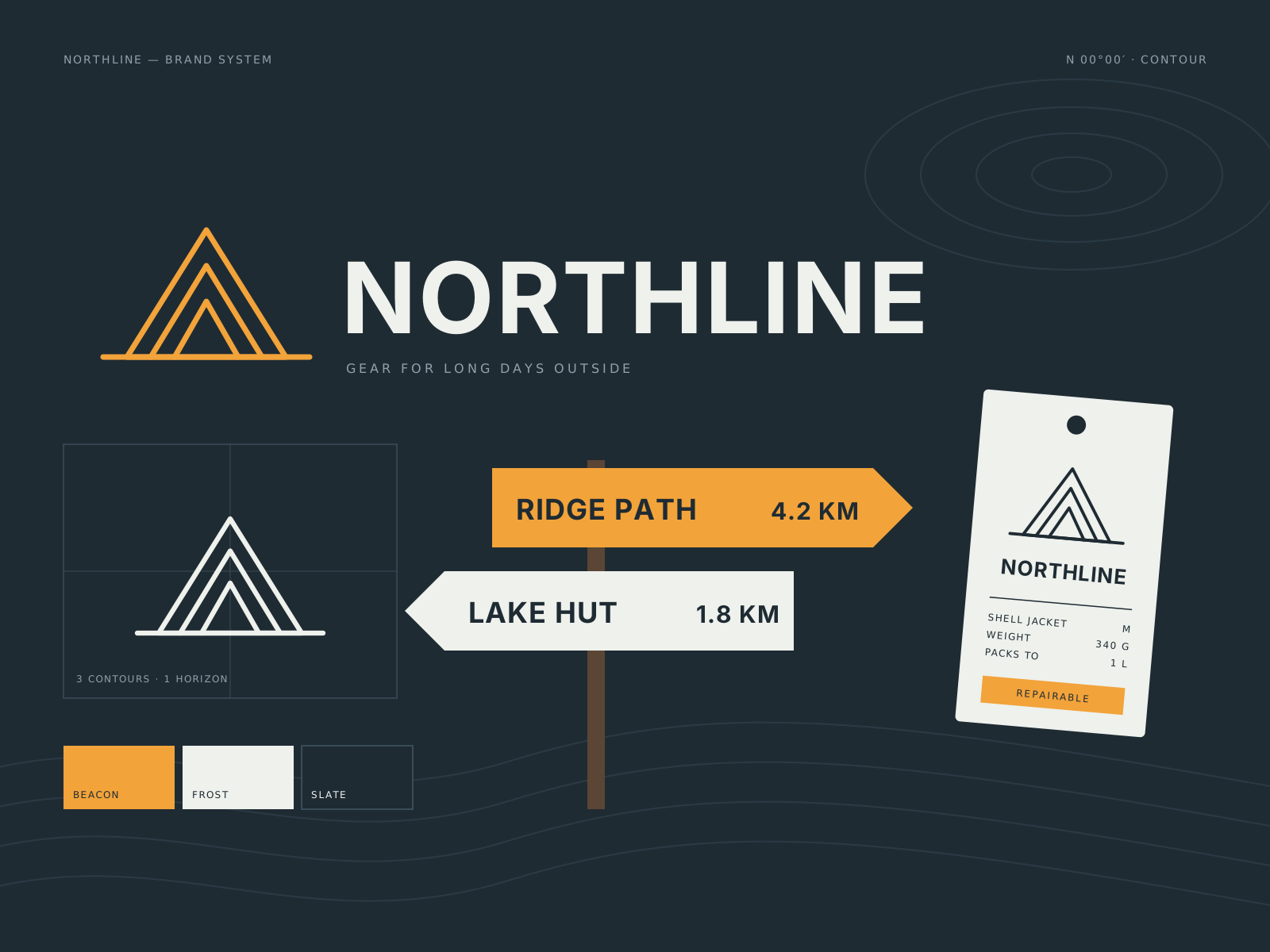
We created a brand system covering the symbol, wordmark, colour, type and a family of applications, from product labels and swing tags to retail signage modelled on trail markers.
Challenge
Outdoor branding is often loud, aggressive and full of peaks and arrows. That language suits extreme sport but not a company whose customers value reliability and quiet competence.
The system had to survive tough conditions: printed on fabric, stitched as a patch, embossed on buckles and seen from a distance on a hillside sign.
Creative approach
- 01
A symbol from contours
The symbol is a set of stacked contour lines that also reads as an N. It is simple enough to be stitched, embossed or cut from a single colour, and it scales down to a zip pull.
- 02
The voice of a trail sign
Trail signs say exactly what you need and nothing more: a place, a distance, a direction. We used that as a model for product labels and retail copy, with short, factual lines in a sturdy condensed sans.
- 03
High-visibility accent
The palette is mostly deep slate and off-white, with one bright amber taken from safety equipment. The accent is reserved for things that matter, such as fit information or a size, never for decoration.


Deliverables
- Contour symbol and wordmark
- Colour and typography system
- Product labels, tags and woven patches
- Retail and event signage family
- Photography art direction
- Brand guidelines
Timeline
Weeks 1–2
Listen and define
Workshop, product review and a trip along a waymarked route.
Weeks 3–5
Visual idea
Symbol exploration tested on fabric, metal and card.
Weeks 6–10
Make and refine
System design, signage prototypes and label production tests.
Weeks 11–12
Ship with care
Guidelines, master artwork and supplier specifications.
Studio roles
- Creative direction
- Brand design
- Wayfinding design
- Art direction
Sample project created for the Vortex template. Not real client work.
Related work
All projects →- 09View →
Atelier Eight
Identity / Architecture — 2024
- 02View →
Still House
Art direction / Hospitality — 2025
- 04
 View →
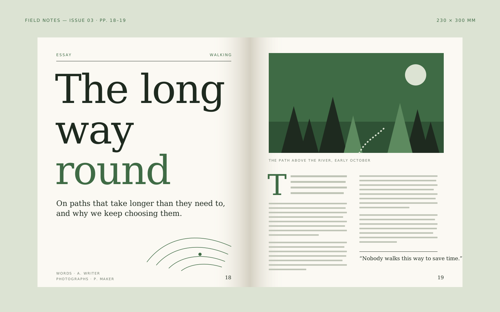
Field Notes
Editorial / Publishing — 2024


Contact
Have a good one in mind?
Tell us what you’re building. We’ll work out the next step together.
Prefer a form? Use the contact page. We usually reply within two working days.