03Case study
Sample projectCommon Ground
A programme website for an imagined community arts festival, designed to make a busy weekend easy to plan.
- Discipline
- Digital experience
- Sector
- Culture
- Year
- 2025
- Services
- Digital, Web Design, UX
Overview
Common Ground is a fictional three-day festival of music, talks, food and workshops across a dozen venues in one neighbourhood. Its audience is wide: families, students, regulars and people who simply walk past and wonder what is happening.
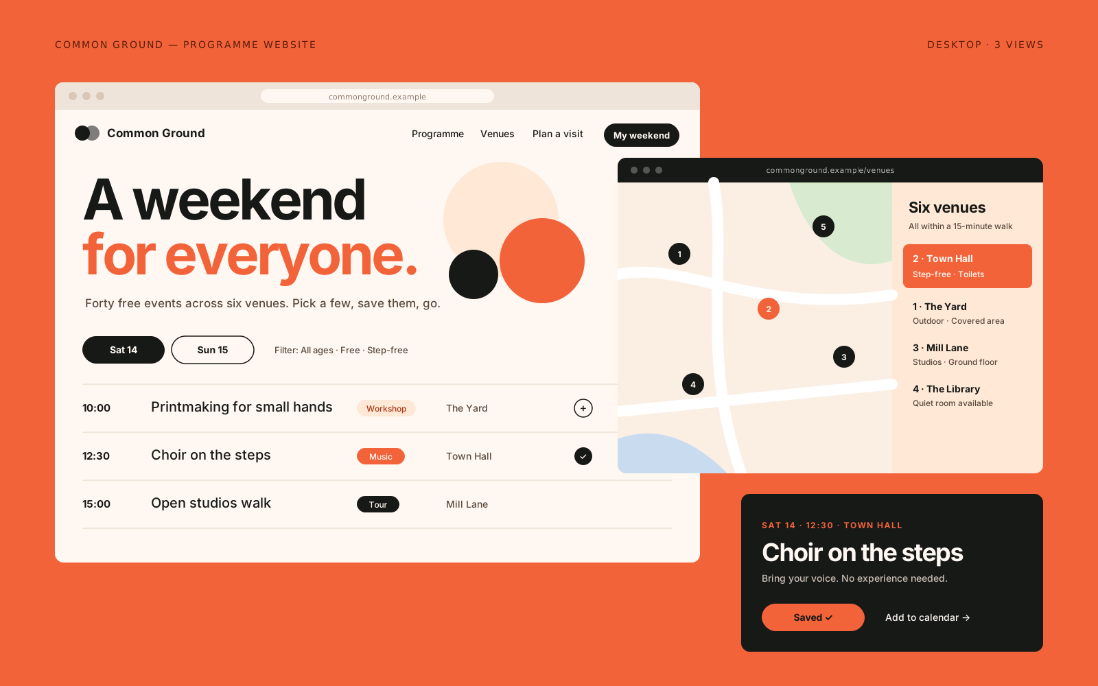
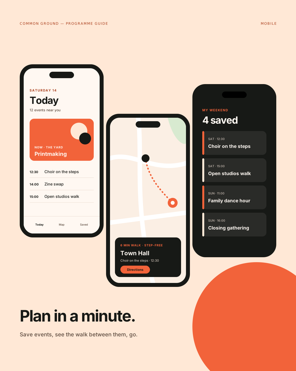
We designed and built a programme website that answers the questions visitors actually have: what is on now, what is near me, and what can I bring the kids to. It is fast on a phone, legible in sunlight and clear about access.
Challenge
Festival sites often look exciting and work badly. Huge hero videos and clever navigation hide the timetable, which is the one thing everyone needs. On the day itself, people are on patchy mobile data, standing in a street, trying to find a venue.
The programme also changes. Events move, sell out or get added late. The site had to make changes obvious without alarming people, and it had to be easy for a small festival team to update.
Creative approach
- 01
Timetable as the homepage
The first thing on the homepage is what is on next, sorted by start time and walking distance. Everything else, from the festival story to the sponsor list, sits below it. Energy comes from colour and type, not from hiding information.
- 02
Filters that speak human
Instead of technical categories, filters use the questions people ask: Free, Good for kids, Step-free, Ends before 9pm. Filters can be combined and are kept in the URL, so a shared link opens the same view.
- 03
A map that knows its limits
The venue map is a simplified drawing, not a full street map. It shows the twelve venues, toilets, water points and step-free routes, and each venue links to directions in the visitor's own map app.
- 04
Built for a bad signal
Pages are light, images are lazy-loaded and the programme is cached for offline reading once visited. Late changes appear as a clear, dated note on the event itself rather than a banner across every page.


Deliverables
- Information architecture and user journeys
- Programme, event and venue page design
- Filterable timetable and venue map
- Accessibility review and content guidelines
- Front-end build and simple editing workflow
- Social and signage graphics kit
Timeline
Weeks 1–3
Listen and define
Visitor interviews, past programme review and content model.
Weeks 4–5
Visual idea
Type and colour system tested on the timetable first.
Weeks 6–11
Make and refine
Design and build in short cycles, with usability checks on real phones.
Weeks 12–13
Ship with care
Content entry, editor training and a pre-festival performance check.
Studio roles
- Creative direction
- UX design
- Interface design
- Front-end development
Sample project created for the Vortex template. Not real client work.
Related work
All projects →- 07
 View →
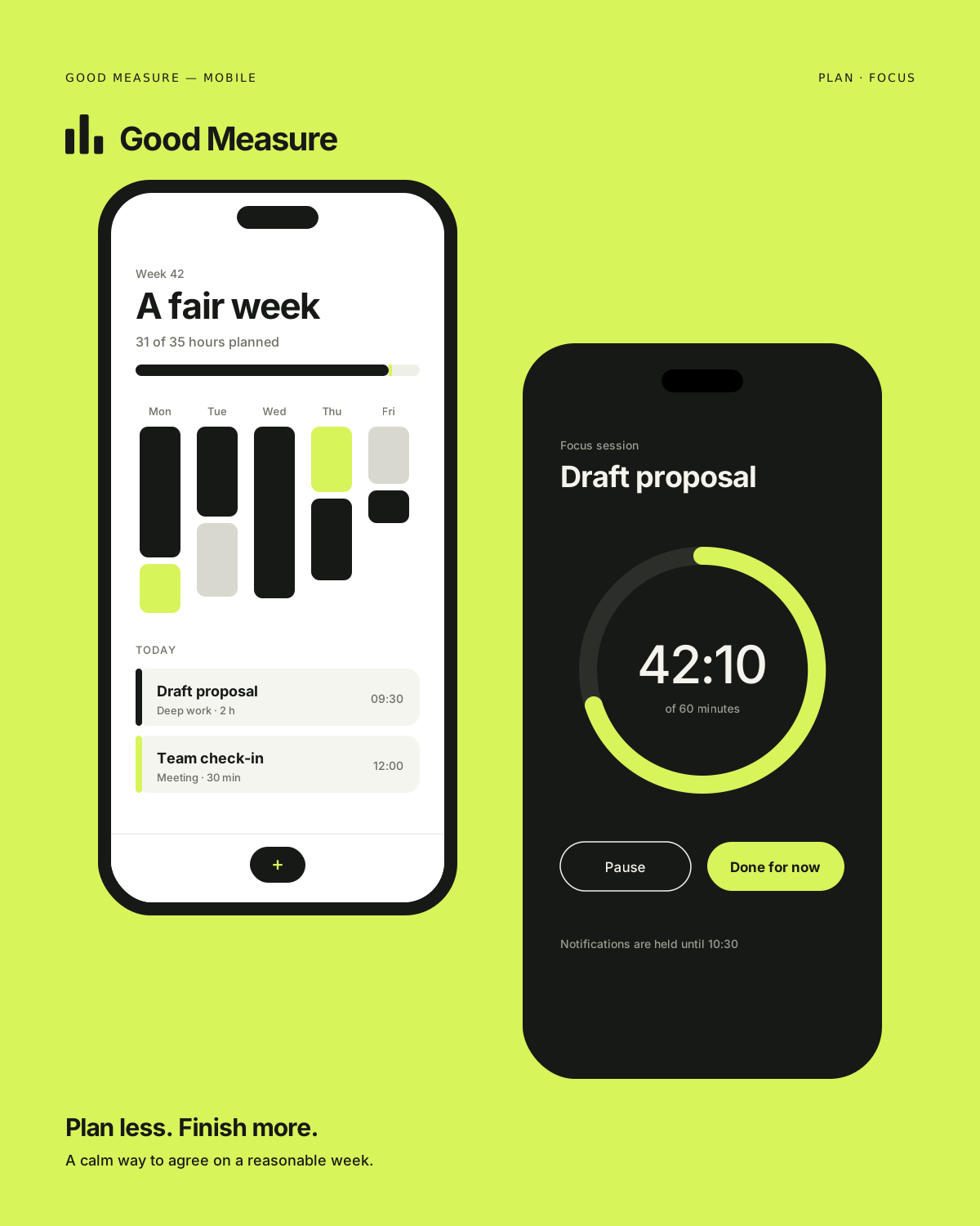
Good Measure
Digital product / Technology — 2026
- 11
 View →
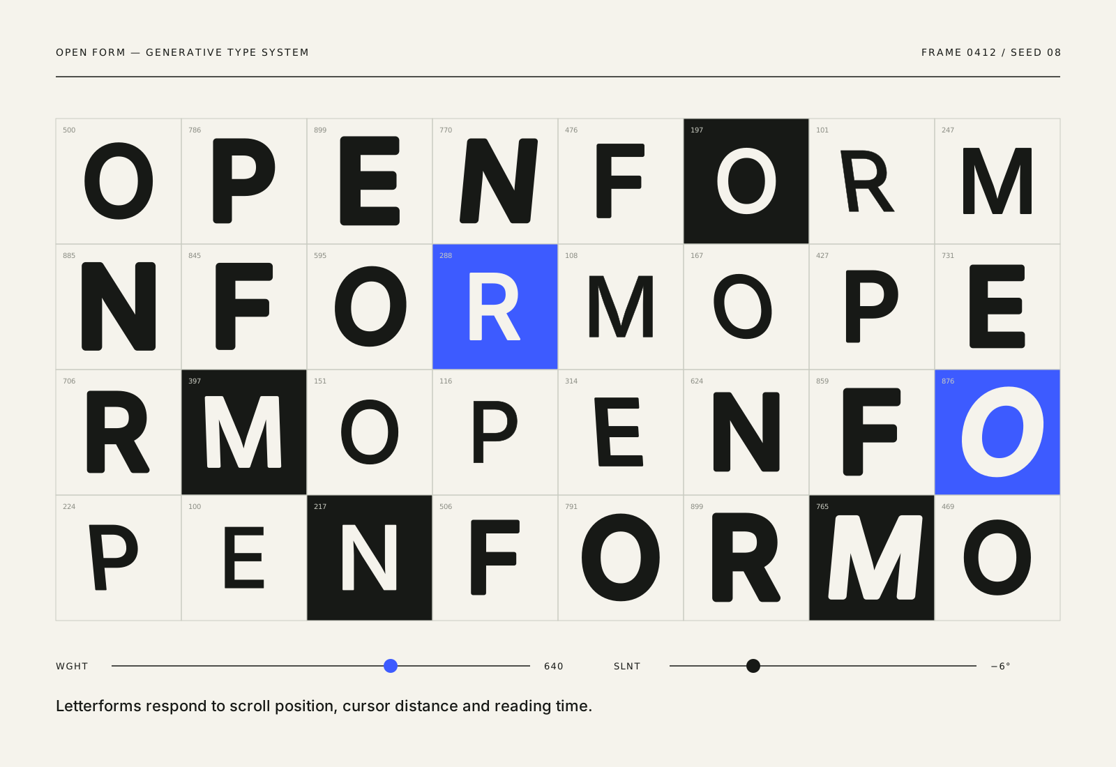
Open Form
Website / Creative technology — 2026
- 12
 View →
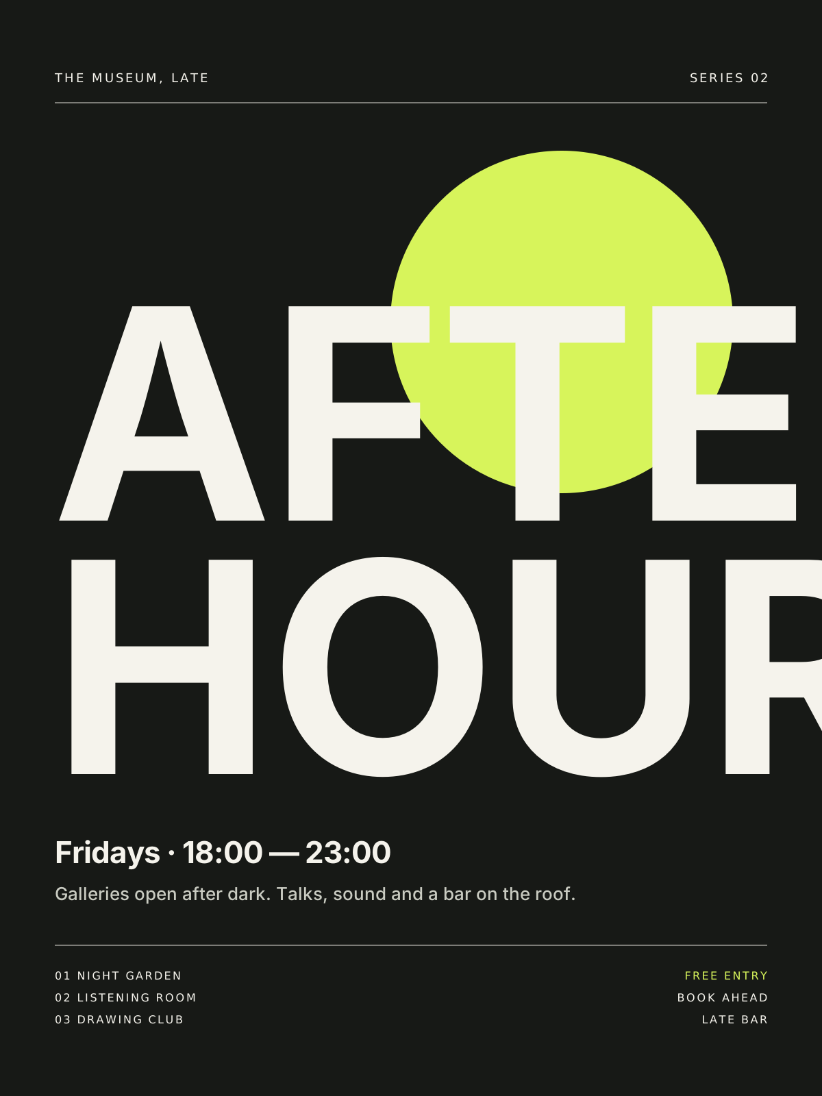
After Hours
Campaign / Culture — 2026
Contact
Have a good one in mind?
Tell us what you’re building. We’ll work out the next step together.
Prefer a form? Use the contact page. We usually reply within two working days.