02Case study
Sample projectStill House
Art direction for an imagined mountain hotel, built around slow mornings, long shadows and very little noise.
- Discipline
- Art direction
- Sector
- Hospitality
- Year
- 2025
- Services
- Art Direction, Photography, Brand

Overview
Still House is a fictional twelve-room hotel set high above a valley. Its whole proposition is quiet: no spa menu, no activity schedule, just good rooms, a short dinner menu and a view. Our job was to make the brand feel the way a stay there should feel.
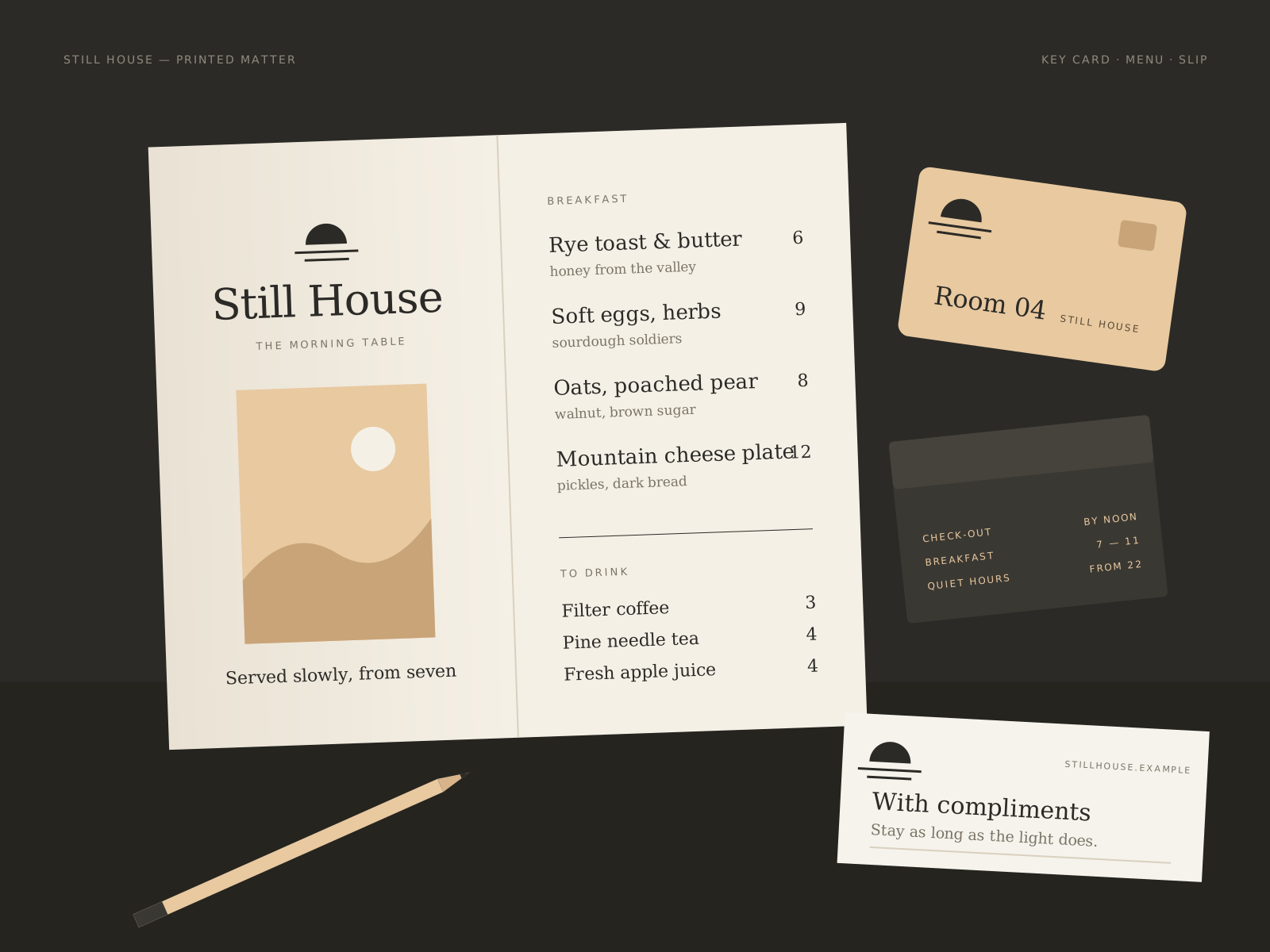
We set the art direction for photography, wrote a tone of voice, and designed a small family of printed pieces, from key cards to menus, that guests actually touch during their stay.
Challenge
Hospitality imagery is usually crowded with smiling guests and perfect breakfasts. That sells activity, which is exactly what Still House does not offer. We needed images that show calm without becoming empty or cold.
The printed pieces had a similar problem. Hotels often ask stationery to do too much: logos, offers, social handles and fine print all on one card. We wanted every printed item to carry one idea at a time.
Creative approach
- 01
Shoot the hours, not the rooms
Instead of a shot list of spaces, the photography brief is organised by time of day: first light on the terrace, the low sun at dinner, the dark hour after. People appear only at the edges of a frame, or as an empty chair recently left.
- 02
A palette taken from shadow
The colours come from what light does to the building: warm plaster, dark timber and a pale sand tone for paper. Nothing in the palette is brighter than the view outside.
- 03
Words that slow down
We wrote a short tone of voice built on plain sentences and very few adjectives. The welcome card simply says what time breakfast is and where the good chair is. Restraint in the copy does as much work as the images.


Deliverables
- Photography art direction by time of day
- Tone of voice and core copy
- Room key cards and compliments slips
- Dinner and breakfast menus
- Wayfinding signs for the building
- Website image library selection
Timeline
Weeks 1–2
Listen and define
A stay on site, guest journey mapping and an image audit.
Weeks 3–4
Visual idea
Mood studies and a test shoot across a single day.
Weeks 5–9
Make and refine
Main shoot, editing, print design and paper sampling.
Weeks 10–11
Ship with care
Image library, print artwork and a short art direction guide.
Studio roles
- Creative direction
- Art direction
- Copywriting
- Graphic design
Sample project created for the Vortex template. Not real client work.
Related work
All projects →- 01View →
Forma Objects
Brand identity / Product — 2026
- 06View →
Northline
Brand system / Outdoor — 2024
- 08View →
Sunday Market
Campaign / Food — 2025


Contact
Have a good one in mind?
Tell us what you’re building. We’ll work out the next step together.
Prefer a form? Use the contact page. We usually reply within two working days.