Designing Digital Experiences with a Clear Point of View
Many websites are technically fine and instantly forgettable. A clear point of view does not mean more effects. It means deciding what matters and designing everything around it.
- Published
- Reading time
- 4 min read
- Status
- Sample article
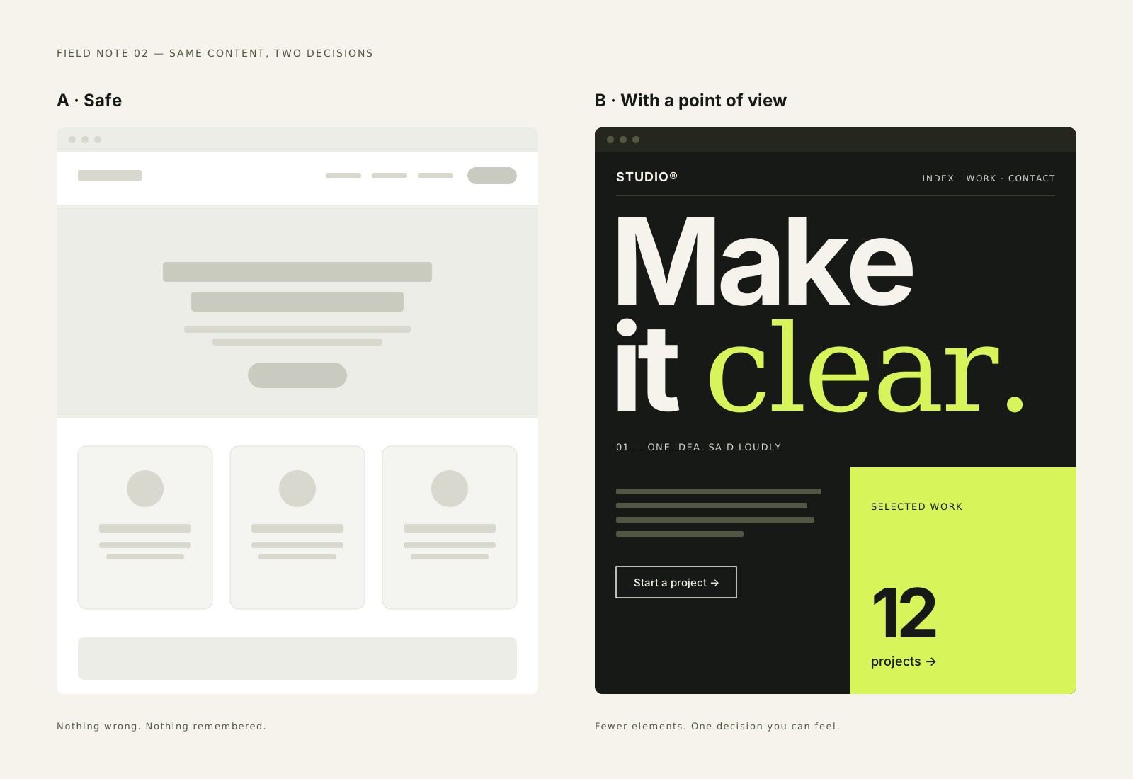
There is a familiar kind of website that nobody dislikes and nobody remembers. A large photograph with a headline on top. Three columns of features with small icons. A row of logos, a testimonial carousel and a footer full of links. It works. It loads. And it could belong to almost any company.
These patterns exist for good reasons. They are familiar, easy to build and easy to approve. But when every site uses them, the result is a web where brands are interchangeable. A point of view is what makes a digital experience feel like it belongs to someone in particular.
A point of view is a decision, not a decoration
When people hear 'distinctive website', they often picture motion, unusual navigation or experimental layouts. Sometimes those are right. More often, a strong point of view is simpler: a decision about what matters most, followed through with discipline.
For a festival, that might be the timetable, placed first and designed beautifully. For a portfolio, it might be the work itself, given so much space that everything else steps back. For a product, it might be one interaction that is so clear it explains the whole service. The decision shapes the layout, the type, the pacing and even what gets left out.
The most distinctive thing a website can do is decide what matters and refuse to dilute it.
Start with a sentence
Before any wireframes, we try to write one sentence that describes how the experience should feel and what it should prioritise. Not a mission statement, but a working brief. For example: 'A calm planning tool where the whole week fits on one screen.' Or: 'A portfolio you move through like an exhibition, one piece at a time.'
That sentence becomes a filter. When someone suggests a new feature, a banner or an extra section, it either supports the sentence or it does not. It is surprising how many design debates become simple once there is something agreed to test them against.
Protect usability while you take risks
A point of view should never come at the cost of basic usability. If a horizontal gallery is the central idea, people still need to be able to scroll the page normally, use the keyboard and find their way out. If the typography is expressive, the body text still needs to be readable. The idea sits on top of solid foundations, not instead of them.
- Keep navigation predictable, even when the layout is not.
- Make every interactive idea work without animation.
- Respect reduced-motion settings and keyboard users from the first prototype.
- Give unusual interactions a clear label or instruction.
- Always offer a simple alternative route to the same content.
These are not restrictions on creativity. They are what make an ambitious idea safe to ship. A strong concept that half your visitors cannot use is not a strong concept.
Design the pacing, not just the pages
Digital experiences unfold over time. One of the most useful tools for building a point of view is pacing: where the experience speeds up, where it slows down, and where it pauses. A dense section followed by a single large image. A long horizontal sequence followed by a calm column of text. Contrast in pace makes each part feel deliberate.
Generic sites tend to have one pace from top to bottom: section, section, section, all the same height and density. Varying the rhythm is often the quickest way to make a site feel authored.
Let the content set the form
Templates encourage content to be cut to fit. A clearer approach is to look at what you actually have to say and show, then shape the layout around it. Long case studies need room for reading. Image-heavy work needs scale. Short announcements need very little. When the form follows the content, the site feels specific without trying.
Say no more often
The hardest part of keeping a point of view is not the first design. It is the months after launch, when new requests arrive and each one seems reasonable on its own. A popup here, an extra carousel there. Over time the original idea gets buried.
Writing down the core idea, the rules that protect it and the places where flexibility is welcome makes those decisions easier for everyone. A digital experience with a clear point of view is not just designed once. It is defended, kindly and consistently, for as long as it lives.
Keep reading
Identity ·
Why a Good Identity Needs More Than a Logo
Process ·
What Makes a Portfolio Case Study Useful
Process ·
Briefs That Leave Room for Ideas
Contact
Have a good one in mind?
Tell us what you’re building. We’ll work out the next step together.
Prefer a form? Use the contact page. We usually reply within two working days.