05Case study
Sample projectMorrow Skin
Packaging for an imagined, pared-back skincare range where colour tells you what time of day each product is for.
- Discipline
- Packaging
- Sector
- Beauty
- Year
- 2026
- Services
- Packaging, Brand, Print
Overview
Morrow Skin is a fictional skincare brand with a deliberately short range: a morning cleanser, a day serum, an evening oil and a night cream. Its promise is that you never need to wonder which bottle to reach for.
We designed the brand identity, a label system and the full set of primary and secondary packaging, from pump bottles and droppers to cartons and refill pouches.
Challenge
The skincare shelf is crowded with near-identical white bottles and gentle sans-serifs. A new brand needs to be distinct without shouting, and to feel trustworthy without looking clinical.
Regulations also put a lot of required text on very small labels. The system had to make room for ingredients, warnings and batch details without letting them overwhelm the product name and its purpose.
Creative approach
- 01
Colour as an instruction
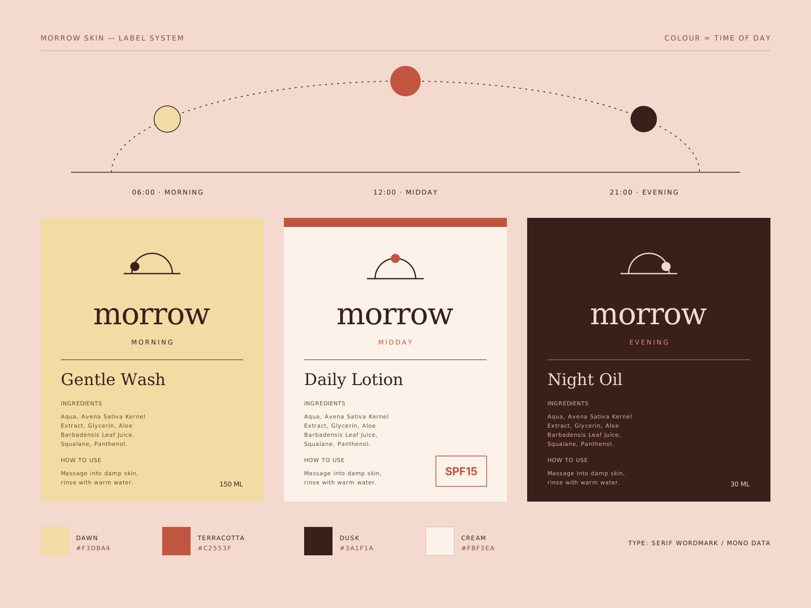
Each product takes a colour from the sky at the hour it is meant for, from pale dawn pink to deep dusk red. The colour is a functional cue first and a brand expression second.
- 02
A two-zone label
Every label is split into a front zone with only the product name, time of day and size, and a back zone that holds all regulatory text in a strict grid. Nothing from the back is allowed to creep forward.
- 03
Fewer materials, better made
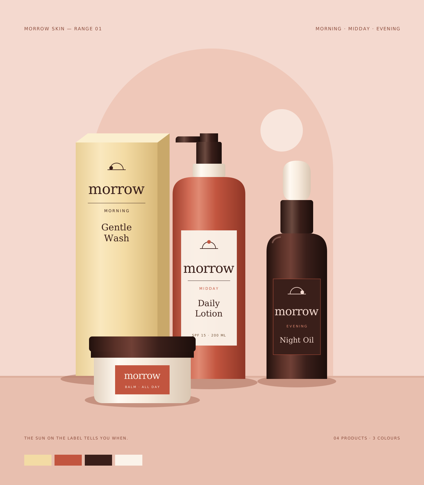
We specified a small set of components shared across the range: one bottle shape in two sizes, one jar and one carton style. Fewer moulds and fewer inks keep the range consistent and simpler to produce.
- 04
Refills that look intentional
Refill pouches use the same layout and colour as the bottle they fill, so they feel like part of the range rather than a cheaper afterthought.

Deliverables
- Brand identity and wordmark
- Colour-coded range architecture
- Label system and regulatory text grid
- Bottle, dropper, jar and carton artwork
- Refill pouch design
- Packaging photography art direction
- Print and finishing specification
Timeline
Weeks 1–2
Listen and define
Range review, shelf audit and packaging constraints.
Weeks 3–5
Visual idea
Colour logic tested on mock bottles in different light.
Weeks 6–10
Make and refine
Label system, prototypes and print proofs on final materials.
Weeks 11–12
Ship with care
Production artwork, specifications and supplier handover.
Studio roles
- Creative direction
- Packaging design
- Brand design
- Production artwork
Sample project created for the Vortex template. Not real client work.
Related work
All projects →- 01View →
Forma Objects
Brand identity / Product — 2026
- 08View →
Sunday Market
Campaign / Food — 2025
- 07
 View →
Good Measure
Digital product / Technology — 2026


Contact
Have a good one in mind?
Tell us what you’re building. We’ll work out the next step together.
Prefer a form? Use the contact page. We usually reply within two working days.