Choosing Typefaces for Systems, Not Moments
A typeface that looks wonderful in a headline can fall apart in a table, a form or a long report. Here is how we choose type that holds up across a whole identity.
- Published
- Reading time
- 4 min read
- Status
- Sample article
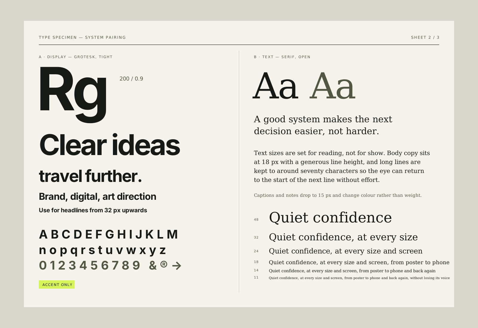
Type choices often start with a single beautiful moment: a headline set large on a poster, a wordmark on a shop sign, an opening line on a homepage. Those moments matter, but they are a small part of how type is actually used. Most of the time, a brand's typefaces are working in tables, forms, captions, invoices, emails and long documents.
Choosing type for a system means choosing for all of those places, not just the one that looks best in a presentation.
Give each typeface a clear role
Most systems need two or three typefaces at most, each with a distinct job. A display face for headlines and moments of personality. A text face for reading. Sometimes a utility face, often monospaced or condensed, for labels, numbers and small details. When roles are clear, people using the system know which typeface to reach for without asking.
- Display: carries character and is used sparingly at large sizes.
- Text: comfortable for long reading on screen and in print.
- Utility: handles labels, data, captions and metadata clearly.
Sometimes a single family with a wide range of weights and widths can cover all three roles. That can be a very elegant solution, as long as the roles are still described clearly.
Define a small scale
Alongside the typefaces, a system needs a type scale: a short list of sizes, each with a name and a purpose. Six or seven steps is usually plenty, from a small label size up to the largest display size. Pair each step with a line height and, where it helps, a letter-spacing value. A named scale stops every new page inventing its own sizes, and it makes the relationship between headings, text and captions predictable. That predictability is a large part of what makes a brand feel consistent, even when people cannot say exactly why.
Test in difficult layouts
Specimen pages flatter typefaces. Real layouts reveal them. Before committing, we set candidate faces in the hardest places the brand will use them: a dense pricing table, a form with error messages, a long paragraph on a phone, a caption over a photograph, a slide written in a hurry.
Specimen pages flatter typefaces. Real layouts reveal them.
Things to look for include how numbers line up in columns, whether similar letters are easy to tell apart at small sizes, how bold and regular weights work together, and whether italics are good enough to use for emphasis. A display face that looks striking on a poster may have awkward figures or no usable italic at all.
Check the details that are easy to miss
Language support matters if the brand works in more than one language or might in future. So do symbols such as currency signs, arrows and fractions. It is far easier to check these at the start than to discover a missing character on a printed menu.
Think about how the type will be used
A system is only as good as its use by the people who were not in the design meetings. If the brand's teams write documents in an office suite or build pages in a website builder, the typefaces need to be available there too. Sometimes this means choosing a widely available fallback and documenting exactly when to use it.
Licensing is part of this decision, not an afterthought. Different licences cover desktop use, websites, apps and broadcast, and the costs can change significantly with the size of the organisation. Open-source typefaces remove some of that complexity, though they still deserve the same testing as any commercial face.
Choose for the long term
Trends in type move quickly. A face that feels fresh this year may feel dated in three. That is not a reason to avoid character, but it is a reason to ask whether the character comes from the typeface itself or from how it is used. Strong identities often pair a fairly neutral text face with a more distinctive display face, so that the display can evolve without rebuilding everything.
In the end, good type for a system is type that disappears when it should and speaks up when it is asked to. It rarely wins a single slide. It wins the hundredth document, the busy form and the small label that someone reads correctly without thinking about it.
Keep reading
Contact
Have a good one in mind?
Tell us what you’re building. We’ll work out the next step together.
Prefer a form? Use the contact page. We usually reply within two working days.